Designing an effective logo
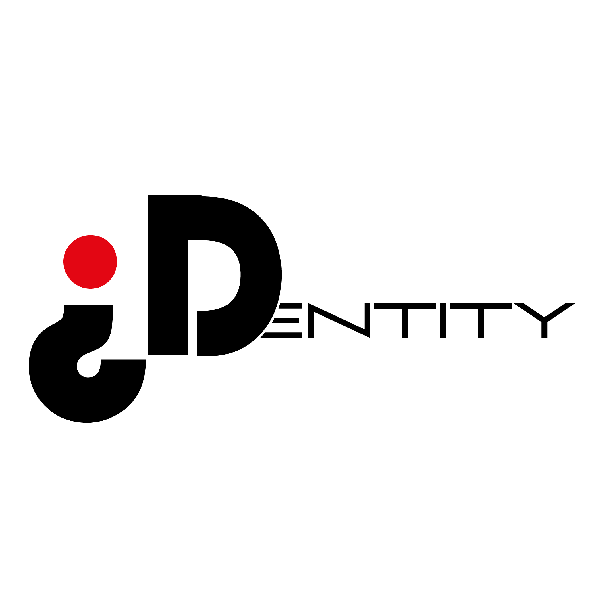
As part of this project, I will be tasked with designing a identity logo that is gender neutral and this is some of the secondary research that I found on the Internet. (smashingmagazine.com, 2008/2009)
The logo design process when creating a logo there is a process to ensure that the clients needs are meet. Having tried previously to conceptualise and creating designer logo I’m very well aware of the pitfalls of this so it’s good to have some guiding and some parameters to work within to help even out any pitfalls that may develop over this process here are some bullet points regarding a plan for designing.
- Brief
- Research
- Reference
- Sketching and conceptualising
- Reflection
- Presentation
- Develop and support
Brief it’s the opportunity for the client to relay the information and the concepts of their idea to you with important information that can be make it easier to have a better understanding of their needs and direction.
Research what is the industry organization what’s their ethos, values or direction that the organization is heading towards.
Sketching and conceptualizing this is a really quick method of getting ideas from your head onto paper without spending too much time allowing the design process to flow more easily.
Reflection it’s good to have some time after creating some designs to allow the process to sink in then look again with some fresh eyes seeing mistakes possible contamination from other designs and also asking for feedback from other people there might be something that it’s blatantly obvious that you haven’t noticed that’s clear as day for others Presentation this is opportunity to showcase your work to the client colleagues’ team etc. just keeping it simple as there.
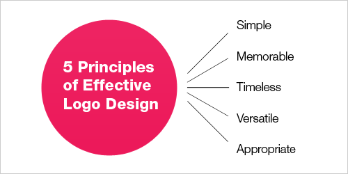
Simple designs the logos are really recognizable uncluttered make some memorable and also timeless keeping it basic and simply makes it versatile on the key factor is that it’s appropriate to the organization brand or company.
What MAKES A GOOD LOGO?
What is the Function of a Logo? (meduim, 2019)
To understand what a great logo is, we must first consider its purpose. A logo is essentially a tool for conditioning. Businesses need a way to differentiate their products and services from their competitors, and they do this through unique stylization of the packaging, advertisements, and messages that they offer. If logos and branding didn’t exist, there would be no way to easily indicate who you were buying from. We would be stuck reading every single label and description for every product. Products and services would then be stripped down to their pure utility—we could only determine the value of something based on its actual function. Although this is a Marxist dream, imagine if every product, restaurant, and company had the exact same label set in the same type with the same colours. Would that not be a more boring world to live in? Thus, novelty is extremely important in business, culture, and branding. To conclude, a logo is the unique form (smallest amount of stimuli) that communicates the ownership of a particular good or service.
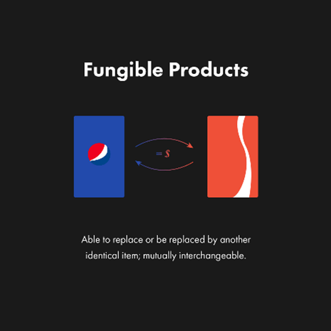
Logos (and branding) are important because products and services are relatively fungible. Fungibility refers to the property of a good or commodity that is essentially interchangeable. Consider a can of Coke and Pepsi for example. Both of these products offer almost exactly the same amount of extrinsic value. The amount of liquid and sugar is nearly identical, and most customers can’t actually distinguish their taste (study). This makes branding particularly important for products where the utilitarian value is essentially the same, which is actually most of them. This, coupled with the fact that many of our purchasing decisions are emotional—a well-formulated ‘schema’, or mental representation really matters when trying to instil a deep emotional connection with the product or service. Classically, companies do this by telling stories that humans associate with the company’s visual assets. For example, we know a McDonald’s restaurant is a McDonald’s restaurant based on the visual look of the storefront, signs, and banners. McDonald’s in their advertisements pairs this schema with images stories of joy, youth, and happiness to evoke a positive emotional response that we unconsciously internalize. Designers pair stimuli with stories—that’s what branding really is about.
The Qualities
Quality 1: Great Logos Can Be Recreated by Hand, Off Memory
If an individual can notice, remember, and replicate a logo with relative ease, then you’ve probably got a good one. Think about the Nike swoosh, McDonalds arches, and Adidas three stripes. All of these are simple and memorable enough for people to easily replicate. If one is not able to replicate the logo, it’s a sign that it isn’t ‘structurally’ adequate for it to be stored in long-term memory, which can be caused by complexity or banality.
The replication test is something I always run by with my clients, and it’s also one of the hardest tests to design for. Think about how many simple forms currently exist but already represent a certain thing or function. Unicode 7, the universal character encoding software has 113,021different graphemes—and this isn’t even counting glyphs (from different typefaces etc). Moreover, the challenge for designers lies in creating something that is completely unique and isn’t mistaken for something else. Although one could literally have a company with the logo ‘+’, it may not be memorable enough to ‘stick’ in the minds of viewers. This is even truer in the digital age, where thousands of businesses are invented and advertised every single day. There’s a lot of information to compete with, so logo forms then have to be unique for the sake of mnemonics.
What lessons can be learned from the top designs
logo is like the front door of a business. It’s a first impression. It’s a greeting. It’s got an energy. The world’s most iconic and famous logos have this down.
What makes a famous logo design? (Paish, 2022) Successful logos are immediately recognizable, reflect a brand’s message and stand out from the crowd. They build trust and look timeless and professional. Effective logos also work at any size and anywhere. The top 10 iconic logos below manage to do all this and more.
Markets and trends are always changing, but certain characteristics like typography, layout, patterns and colour have a huge impact on how people perceive a logo. Knowing how the big brands do it right will help you refine your own brand and connect with your audience.
Let’s dive in and take a look at the top company logos that have really raised the bar with their design, why they have been so successful, and what we can learn from their iconic logo designs.
Target The history
Target created their unique and synonymous logo in 1962. Originally, it had three white and three red rings with the company name boldly displayed across it. Just seven years later, the company launched a famous ad that featured a woman wearing the Target logo as an earring—the earliest use of Target’s branding becoming “unexpected.”

In 1989, the company temporarily removed the image from its logo, and it became a text-only wordmark with “TARGET” in bold lettering. But in 2006, the iconic, standalone bullseye returned with the text removed.
The design
What better way to represent the name “Target” than by using an actual target? Makes sense, right? Simple, yes. But the passion behind the design goes deeper.
Target’s logo stands out due to its strong use of the colour red and striking simplicity. Many of the logos we will visit in this piece have stood the test of time due to their impressive minimalist design, and the Target logo is the most prominent in this regard.
The circle-within-a-circle logo design communicates universally. The use of negative space beyond the outer red ring carefully creates an image of strength and trust. Circles convey friendship, community, and endurance—traits which are all important to the Target brand.
In business, the colour red denotes passion, importance. and attention. White represents cleanliness, virtue and health. When we explore the philosophy of the company, the colours used in their logo design match perfectly with the vision and purpose of the corporation.
It’s incredible how much thought and effort went into such a simple logo
FedEx The history
The original FedEx logo was born in 1973, a plain blue wordmark on a patterned blue background. Over the years, the colours and typeface have changed. But in 1994, the company introduced the logo we know today, with the iconic white arrow visible between the second E and the X.

The design
I have given the game away already… FedEx hid a white arrow inside the last E and X, a subliminal symbol of speed, movement and precision—very important traits for a delivery and logistics brand.
FedEx also represents multiple arms of their company through a clever use of colour. While maintaining the purple colour of the “Fed” in the logo design, the “Ex” portion changes based on the product. The most common colour combination we see is purple and orange for FedEx Express, the service used for the bulk of packages.
Pretty cool, right? We think so.
By changing one of their logo colours, the company can symbolize each aspect of their company in a different way. Because colour psychology is so important in business, each colour can intentionally reflect a specific aspect of your brand.
In the next section I have focused on logos relating to the fashion industry I have correlated a large selection of fashion houses just to compare the style and look of logos
As you can see the majority of logos or simple and clean as described above for maximum impact they normally relevant to the the name of the fashion house this is one of the key features I think I will carry into my logo.

Reference
meduim, 2019. Medium.com. [Online]
Available at: https://medium.com/swlh/what-makes-a-great-logo-c7b0e8c4b9e3
Paish, C., 2022. 99designs. [Online]
Available at: https://99designs.co.uk/blog/logo-branding/famous-logos/
smashingmagazine.com, 2008/2009. .smashingmagazine.com. [Online]
Available at: https://www.smashingmagazine.com/2009/08/vital-tips-for-effective-logo-design/#:~:text=What%20Makes%20A%20Good%20Logo,it%20communicates%20the%20intended%20
