Unit 8 2.1 The design process.
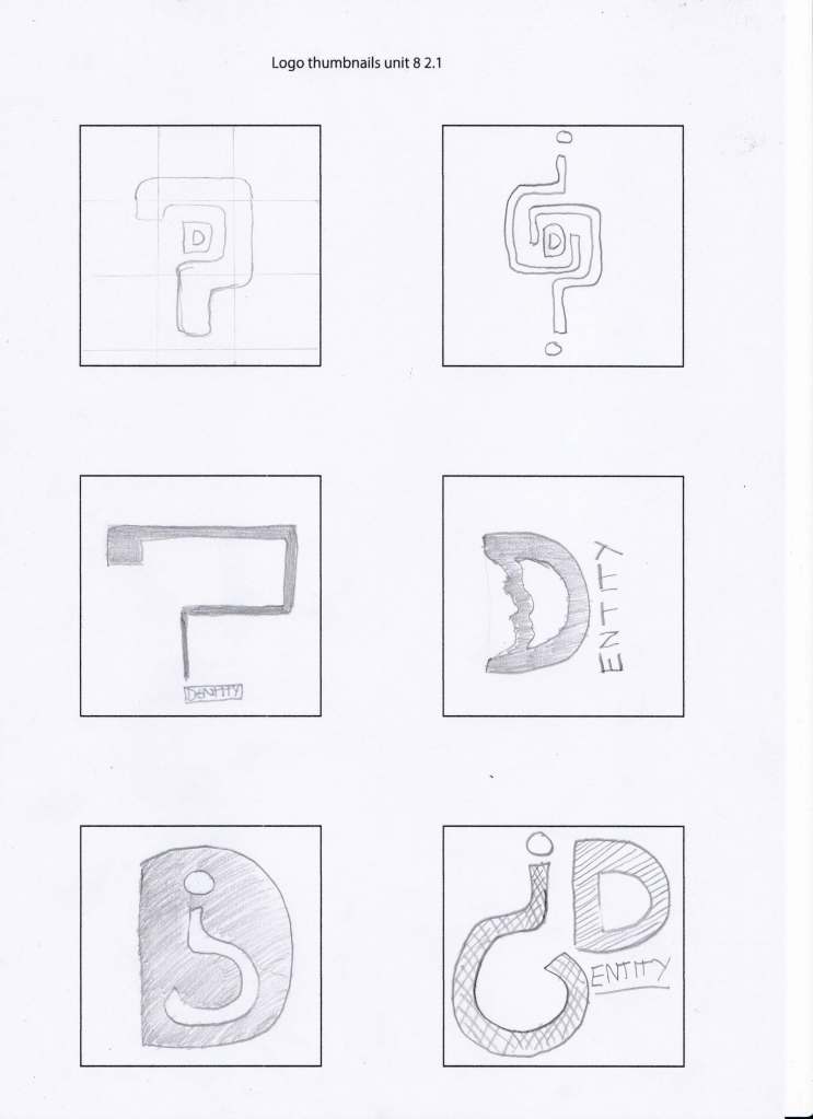
The idea of the question mark came fairly early on in the project. I like the idea of the “I” from identity and changing it into a question mark so I think I had my unique selling point for this brand.
With the concept in mind I explored a few different avenues with the question mark. Like integrating two question marks together to create some sort of harmony. But I don’t feel this work it looked more like a map or a maze that integration. Then a journey like a road map one? Starting really large at one end and going thin at the other end and arriving at the. Also I considered using a generic face on the outside of the D to represent both genders with male being on the outside and the female morphing from the right side but I think this may get lost in.
Turning the question mark upside down was definitely the look and feel to the brand cause it could still be an “I” but it also leaves thoughtful imagination.

Illustrator work on the Logo’s
how will it look ?(2.1)
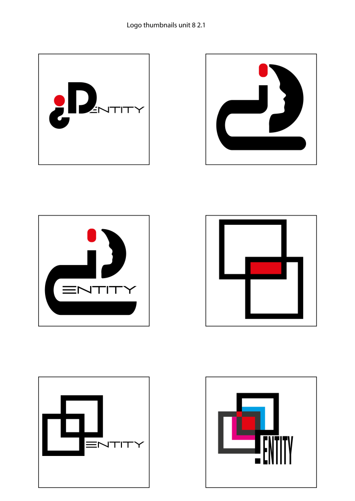
After creating some of the rough ideas sketching the mode the next stage was to create a more refined look? I’ve started with the logo that I felt was most appropriate. I’m just then a simple? With a capital D and then the words of their company. This is very simple fine as a professional feel to it.
I also played on the idea of the face silhouette on the “D” but when I use it with the question mark it seems to look like the cat from the Egyptian.?
I also I was trying to create my own? As you can see from this squares there is a question mark with the two overlapping squares I like this because it also represents a Venn diagram I have been able to use my trademark red in centre but I think this might be so subtle that message might be lost.
And finally from some of the work in the research I’ve used some secret messages in the final square this is the question mark which has been highlighted I’ve shifted off there redundant areas in the squares but also I’ve used colours to represent there historic association with gender and arrows they represent moving away from draconian gender types and also using my trademark red and the centre?


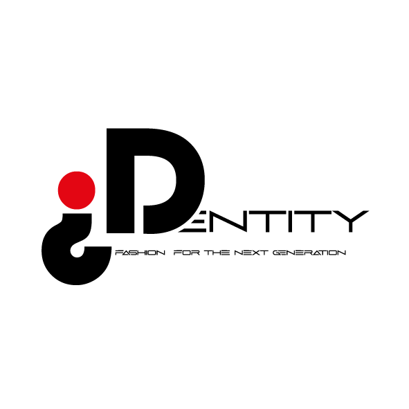
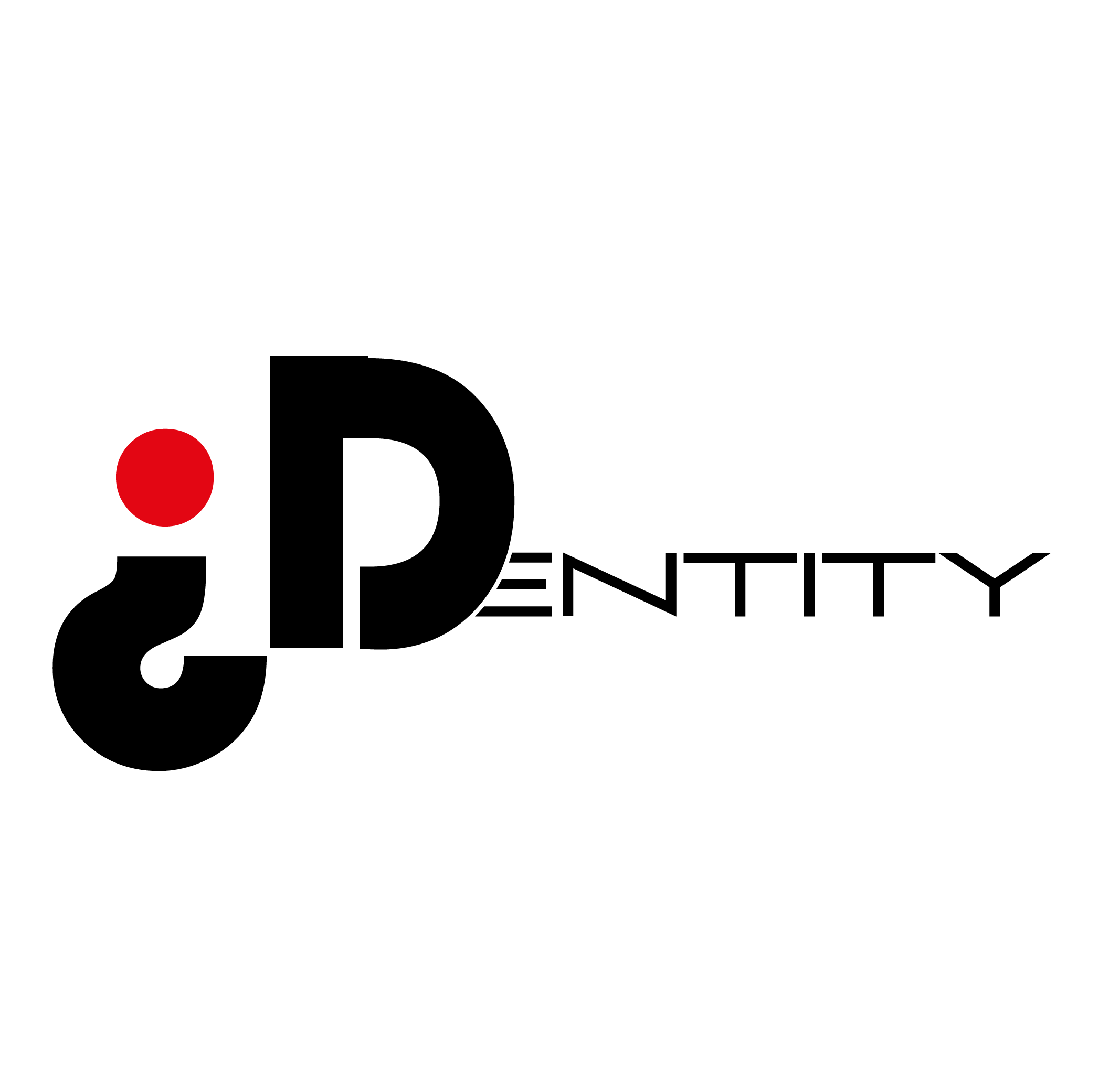
This is the final logo I’ve chosen to represent there company I think it just has a very simple clean elegant professional look it also has the trademark red dot associated with myself I like the idea of their? Being upside down and the gap between the “D” that shows the change is happening transforming?
